|
PICTURE
ANALYSES
I selected some of my
pictures I would like to present for you in details.
I describe why they look as they look and what was my intention when
I created them. I hope at least some of you will enjoy these
descriptions. I also hope that some of you had the same feelings I
present here because it means I achieved my goal.
And I apologize for
my English, I'm working on it...
Darkness and Light
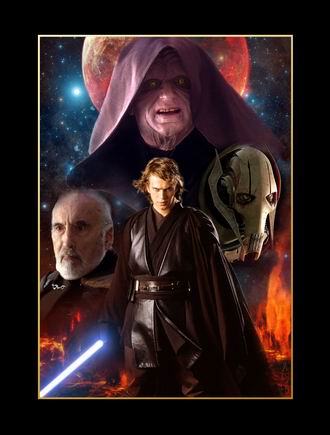 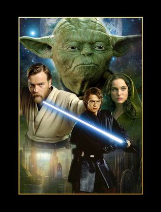
You can see four
characters in each pictures. Anakin is in both of them. These two
posters are reflections of each other somehow: the three characters
at the bottom of the dark picture are in even higher positions from
left to right and it's the opposite in the picture of the good ones.
The background of the 'Darkness' picture is Mustafar: lava fields at
the bottom and the planet itself behind the Emperor. This motif
suggests permanence. In contrast the background of the 'Light'
picture is dual. You can see Coruscant at the bottom of the picture:
the place where Jedi Knights were the guardians of peace and justice
for a thousand years. But this picture is even darker from left to
right because in this episode the good people are enshrouded by the
shadow of darkness and they have to escape. The planet behind Yoda
symbolizes this escape: that planet is not the Coruscant but the
Dagobah, the place of the exile. The place where Yoda will learn the
new ways of the Force from Qui-Gon Jinn. The place where the light
side will resurrect again. This picture of the good ones suggests
change.
I can see the evil in the poster of the dark ones but it does not
suggest the pure evil for me. The sparkling blue background makes
them somehow distant as if we look at them from a distance of light
years. We cannot sense the cruelty in them - they are like the evil
of a tale or a myth. The concert of the blue and red colors softens
the mood of the whole picture.
There is no cohesion between the evil characters - they do not form
a strict unit like the good ones in the other picture. It is because
all of them intrigue against the others. Palpatine's robe bounds
himself from Dooku and it leads our look to Anakin. Dooku is far
from everyone. The robe forms a protective canopy over Anakin and
Palpatine - they are in the middle of the picture and they have to
cooperate in the end.
The pair of the blue-red colors is blue and green - that is why they
are the main colors of the picture of the good ones. You can see the
softening effect here, too. But this picture is not a pure light
side picture because the light side is tumbled in Revenge of The
Sith. The light side is not a calm, peaceful,eternal thing here - it
is troublous and it is in the shroud of darkness as you can see
behind Anakin.
Anakin is smaller in this picture and he shows a lighter face than
in the other poster - but not light enough because his figure is in
great contrast with the light background of Coruscant (not like with
the lava fields of Mustafar) and his saber is pinned on Obi-Wan's
chest. Moreover, his figure is drifted out from the center of the
poster. So the tone of the picture is shifted even more to Yoda. His
face shows the 'worried light'.
Anakin's presence among the good ones makes the mood of this picture
more complex. I really like it because I feel this thing really
complex in Episode III. The good ones are forced to dark ways -
partially, from their own failure. They want to do the right things
but they do not have any chance. Anakin symbolyzes where he was once
(and where can he return to) and that he was the one who rotted the
things from inside, from the light side (like Palpatine rotted from
outside).
Locations of Star Wars Episode I The Phantom Menace: Naboo

I really like Episode
I. Beside the fact that it is a beautiful movie, now, in 2008 it
reminds me my childhood and the great times in 1999. Creating this
poster was a real time travel for me because The Phantom Menace has
had a great impact on my collages. This movie has gave me great
inspiration, my first fairly acceptable collages had been Episode I
ones. So with this poster, I wanted to create something fabulous,
something enthusing.
After this foreword,
let's move to the real description. As you can see, Amidala and Jar
Jar are equally represented in this poster because they depict the
two most intelligent species of Naboo. (Looking at Jar Jar makes me
think that it might be a bit of exaggeration... :) This fact
reflects to the peaceful coexistence of different species which is
one of the greatest messages of Episode I - none of them has more
importance than the other. That's why I placed both Theed and the
Gungan city, Otoh Gunga to the picture.
However, one can
notice the golden halo around Amidala's head. This can be
interpreted at three levels. Firstly, Amidala is the light of her
home planet. Darkness starts to grow after she left for Coruscant
(remember to the midnight scene between Sio Bibble and Nute Gunray,
with that beautiful shot of the palace illuminated by the moon) and
a new day comes when she returns. This is the first level. The
second one is that she represents not only the light of Naboo but
the light of the Republic, too, as she is the one who always
believes in the Republic. As Queen Jamillia says in Episode II, 'The
day we stop believing democracy can work is the day we lose it'.
Amidala represents all the good in the Republic - however, in
Episode I, she is manipulated by Palpatine.
The third level is
the most general one: the golden light represents the beginning of
the Star Wars saga. I think it is important that the very first
location we see in a Star Wars movie is the fabulous green planet of
Naboo, a small reminiscence to the ancient worth of the Republic, a
last remnant of the golden age - I wanted to highlight this aspect.
You can see that I
didn't use any droid battle scenes in this picture - I felt I didn't
want to pollute the fabulous planet with droids and there was
another very important battle to depict: the lightsaber duel between
Qui-Gon, Obi-Wan and Darth Maul. I used a hangar scene because its
color scheme fits well to the other parts of the poster and it's a
hint to the fold-out poster of the booklet of Episode I soundtrack
CD.
If you compare this
Naboo piece with the Episode 2-3 Naboo posters you can notice that
this one is somehow closer to Naboo: the planet is larger and more
definite, not just a shining halo, a symbol like in my EP2-3 Naboo
posters. The reason of this tendency is that in this Episode, we see
Naboo on her own right, she has her place in the whole plot. But in
EP2-3, this changes a bit: there, Naboo represents Padmé primarily.
(Easter egg: can you
see the face of Darth Sidious next to the droid control ship, formed
by clouds? A friend noticed that thing but I must admit it is
unintentional, I never planned this part.)
Heroes of The Republic; Enemies of The Republic
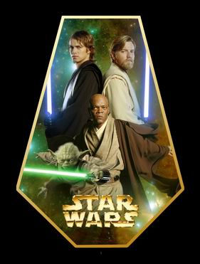 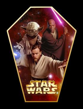
Heroes of the Republic are in a very symmetric composition, in front
of the colors of the light side. Windu and Yoda are reaching out
from the frame. The smaller size of Yoda is balanced by his
lightsaber. Anakin and Obi-Wan are the most popular heroes of the
people of the galaxy - they stand in the background as two columns,
like reflections of each other.
I designed a rectangular frame for this picture originally but it
resulted a lot of empty space and it diluted the message of the
picture. I rather decided to cut the corners and create a
diamond-like frame. This kind of frame tautens the composition
because it focuses on the theme clearly.
Concerning the sequel: the expected title was Enemies of The
Republic but you cannot see the Separatists in the picture - they
are almost the same people who are in the other poster. It is
because I focused on the change of the enemy rather than the
oppositions at the same time. (Palpatine: 'Every single Jedi is now
an enemy of the Republic.') The background is more bodeful than the
other one, its tone is dark red. The symmetry is over. I reversed
the frame because things turned to bad - and the frame looks like a
coffin now.
Forbidden Love: Anakin And Padmé
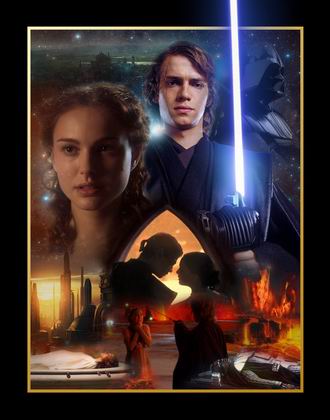
This picture shows
the love of Anakin and Padmé through Episodes II and III. Padmé's
face has warm colors even if one half of her face is wrapped in
darkness and it is lighted only by Anakin's blue lightsaber - but
Anakin is surrounded by cold blue light. The picture of Padmé is
from Episode II when she was happy with their love but Anakin shows
his colder, distant face from Episode III. Darth Vader stands right
behind Anakin: in Vader, there is no sign of feelings to Padmé. He
is the coldest character. If you look at the picture carefully, you
can find Palpatine's face between Anakin and Vader: he is the bridge
between them.
You can follow their
tragic love in the lower part of the poster. The distance between
the two lovers widens continuously and their common fate will end at
the two corners of the picture. I selected the love pledge at the
arena as first step because this is the moment when they decided
their common life. The tide turns in Episode III: the orientation of
the two characters is flipped and Anakin uses the Force to choke his
wife. The result of his twisted anger are two dead people: the
lifeless Padmé in white and the burned Anakin in black who is dead
from an emotional point of view. He turns avay from everything he
believed before: Padmé and the Jedi Order - as you can see in the
upper right corner of the poster.
Three locations make
the story complete: the idyllic green world of Naboo in the upper
side where everything was all right. Red and orange tones dominate the
lower half of the picture - they refer to two other locations. You
can see a twilight of Coruscant under Padmé - a twilight of their
connection. And you can see the lava eruptions of Mustafar under
Anakin...
Darth Sidious
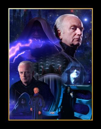
You can see Palpatine's story in this picture: you just need to
follow the characters from the start of the saga to the very end:
from the simple senator to the Emperor. You can see the true face of
the Dark Lord next to the senator as a hologram, of course. His face
is buried into shadow mostly. He is working on his great plan, the
Clone War. After two episodes he reveals himself and becomes
Emperor. I selected this moment as the central part of the poster.
The pervasive blue color cannot enter to this part: Palpatine's red
outfit attracts the eye. The confluence of the window elements of the
Death Star and the chair of the chancellor also rises the eyes to
the senate box. The Emperor shows a different face in Episode V if
you compare it with Episode I: his face is clearly seen and he is
really pleased because all of his former plans are finished.
You can see Coruscant at night behind Sidious: this is the world of
the Sith manipulations.
Anakin Skywalker/Darth Vader
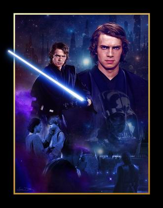 
These two posters are parts of my latest poster series about the
main characters of the Star Wars hexalogy: the only difference is
that I used only one color to create these ones. As Anakin/Vader is
the central character of the saga I decided he deserves a special
treatment which is different from the other Yoda, Sidious and
Obi-wan ones. This approach focuses the events of his life rather
than the evolution of his appearance. That was why I decided to
create two posters about this character and use only blue and red
colors. These colors illustrate the duality and the conflicts of
this character. Cold blue and flaming red. The blue saber of the
Jedi and the red saber of the Sith. Cruelty. Love. Lust for power.
Peace, at the end - this is one man. A fallen hero who raises again.
These pictures can be interpreted independently: the parts are
creating a circle in both of them. But if you put the two pictures
next to each other you can see an additional curve (see the arrows)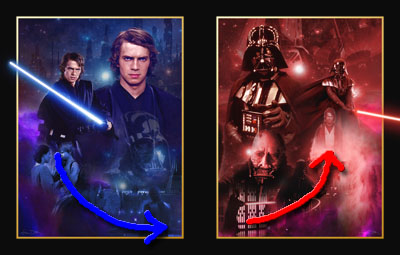 .
This curve guides through all of the six episodes. This curve shows
Anakin's way. The independent circles are vicious circles - they
refer to Anakin's loose of way. .
This curve guides through all of the six episodes. This curve shows
Anakin's way. The independent circles are vicious circles - they
refer to Anakin's loose of way.
The upper parts with the two Anakins and Vaders are 'realistic' but
the lower parts of the posters are merged into a dream in which you
can follow the milestones of the life of the character.
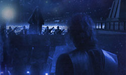
In the Anakin one, you can see his mother, his lover and finally the
moment when he remains alone and turns himself back on everything.
In this moment his face turns to the 'March Against The Jedi Temple'
picture - this is his path. You can see the burned Anakin above,
with the Vader mask on him - the last milestone of his path (in this
picture). And this mask is inside of Anakin in the upper part of
this poster like the dragon from the novelization of Revenge of The
Sith. This is the first vicious circle.
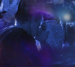 The
only happy moment in this picture is the marriage of Anakin and
Padmé. The two blue-purple curves also underline this event - they
give a soft frame around the lovers. Anakin's farewell from his
mother is a sad moment - still, this is the lightest part of this
poster. The
only happy moment in this picture is the marriage of Anakin and
Padmé. The two blue-purple curves also underline this event - they
give a soft frame around the lovers. Anakin's farewell from his
mother is a sad moment - still, this is the lightest part of this
poster.
I selected the blue color to the Anakin poster. It is in concert
with the blue lightsaber. Red also would be a good choice because
red refers to Anakin's temper. But in my mind, blue refers to the
darker, colder side of Anakin. In addition, this is the main color
of the Palpatine poster and this makes contact between the two
characters - it is important because you cannot see Palpatine in
these two posters. There is another connection between the Anakin
and Palpatine posters: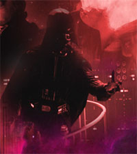 the 'Coruscant cityscape at night' backgrounds. This demonstrates
the monumental pictures of the prequels.
This changes a lot between the two trilogies. Vader's background
represents the 'smaller' size of Episodes IV-V-VI. An imperial
shuttle and an antenna creates a militaristic mood which fits to the
puritanity of the Galactic Empire very well.
Vader's poster part
is the reflection of the Anakin one. It shows the way on which the
Chosen One finds himself again. The primary color is the red of the
Sith - nevertheless, it suggests some kind of warmth if you compare it with the
cold blues of the other poster.
The curve I started in the Anakin poster turns in this one. We can
see Vader slaughters Ben and tries to turn his son to the dark side
of the Force - this is the darkest part of this poster. But at the
end he chooses the light path and after twenty years of isolation
from everyone, Luke takes Anakin's mask off.
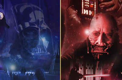 And
now Anakin is not alone: he is looking at Luke's face and he has
Luke's arm on his shoulder. Now, when he is in peace with himself,
he has the company of his son - once more before the death. After
that Vader's helmet burns but his spirit unites with the Force and
comes back to show that he finished the way of the Chosen One. If
you look at the two posters again now and check the curves you can
see that Anakin's position is higher than in the former poster: the
ghost rose higher than the boy. And
now Anakin is not alone: he is looking at Luke's face and he has
Luke's arm on his shoulder. Now, when he is in peace with himself,
he has the company of his son - once more before the death. After
that Vader's helmet burns but his spirit unites with the Force and
comes back to show that he finished the way of the Chosen One. If
you look at the two posters again now and check the curves you can
see that Anakin's position is higher than in the former poster: the
ghost rose higher than the boy.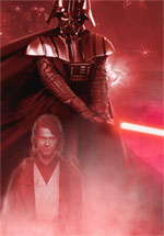
And where is the vicious circle in this picture? Right after this
moment, when Vader looks down and starts to strike down with his
saber - down to the ghost which represents the good in him. 'There
is no conflict.'
I
think the dreamlikeness is important in these posters because
Anakin's fate was determined by dreams in some cases.
Dreams of the people you can see in the Anakin poster.
Ways of The Sith
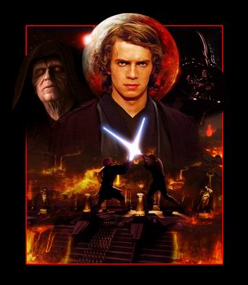
The title of the
picture refers to a deleted sentence from Episode III: Revenge of
The Sith. It was right after Anakin's turn.
ANAKIN: I pledge myself to your teachings. To the ways of the
Sith.

But my original idea was something different. I had two
inspirations: one of them was the latest re-reading of the
novelization of Revenge of The Sith. The other one was that a new
book cover was revealed: Sacrifice. I didn't follow Expanded
Universe, I didn't care much about the story or the cover itself - I
just realized how interesting this title is. Sacrifice. It has a
very strong emotional background. That word was my other
inspiration. But I realised early that I couldn't create the same
picture I planned because some source pictures were not good enough
for that purpose. Thus I changed my mind and also my conception a
bit. I still show you the consequences of Anakin's turn but from a
slightly different point of view.
The basis of the picture is Anakin's march to the Jedi Temple. It is
surrounded by the lava flows of Mustafar as symbols of the final
destruction. The main colors are red and yellow, the picture has
strong shadows, the statues of the temple merge to the lava fields.
This part is my favorite in this picture. I really like its colors,
its mood, its details.
The lower part of
the poster has a kind of cosmic destruction feeling: everything
dies. (From the novelization: 'Everything dies, Anakin Skywalker,
even the stars will fade') This monumental picture serves as a
background of the battle between two giants: Anakin and Obi-Wan.
The upper part of the poster is simplier: you can see here Anakin in
the middle and the two Sith on his left and right sides. The
Mustafar planet looks like a kind of twisted glory around Anakin's
head: it refers to his vileness. Behind the planet the red sun of
the Sith rises.

|
